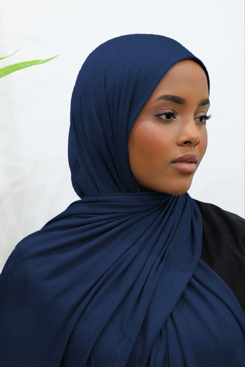
Navy Blue Burqas Offer Quiet Depth — the Details Keep Them From Feeling Severe
Navy has a particular kind of quietness. It is dark enough to feel settled, covered and easy to trust, but it still carries colour. That small difference matters. In bright daylight it can read unmistakably blue; in a hallway, car or winter evening it can look almost black. On a full-coverage garment, where one colour may run from the head or shoulders almost to the floor, that depth can be beautiful. It can also become stern if every other choice is equally heavy.
That is why the most successful navy blue burqa is rarely about the shade alone. The eye notices the line around the face, the way the fabric falls, whether the surface is dry or softly textured, how gathers are placed, what happens at the cuff and hem, and whether any contrast has been used with restraint. None of those details needs to be decorative in a loud sense. In fact, navy often looks best when the details are quiet enough to notice only after the whole outfit has already felt right.
There is another point worth making before we go further. The word burqa is used differently across families, countries and retailers. In some contexts it means a particular full-body covering; in others it is used more loosely for a very covering outer garment, sometimes with a separate face veil. A niqab, meanwhile, is specifically a face veil and should not simply be treated as another word for every garment called a burqa. If you are comparing terminology as well as clothing, our niqab and hijab guide gives the broader distinctions. Here, the focus is narrower: how navy behaves on very modest outerwear and, where a face veil is part of the look, how its construction affects the overall impression.
The aim is not to make navy look "less modest" or to decorate it until its character disappears. It is to understand why one navy garment feels composed and gentle while another, in almost the same colour, feels severe. Once you know what is creating that difference, choosing becomes much easier. You stop asking whether navy itself is too dark and start looking at the details that actually decide how it will feel on you.
Navy is not simply a softer version of black
It is tempting to think of navy as black with a little blue added, especially when you are choosing a deeply modest outfit and want something familiar. In practice, navy has its own behaviour. Black absorbs attention into a very clear dark block. Navy changes more noticeably with light. It can look inky, cool, slightly grey, almost marine or, at the brighter end, noticeably blue. A garment photographed under studio lights may therefore feel quite different once you see it outdoors on an overcast British morning.
This is especially important when the garment covers a large visual area. A small navy scarf can pick up light and still look lively even when the cloth is very dark. A long, loose outer garment carries much more of the shade at once. If the navy is extremely cool, flat and dense, and the cut is also straight and rigid, the whole effect can become more formal than you expected. That does not make it wrong; some sisters want exactly that composure. It simply means that "navy" is not enough information to predict the mood of the finished look.
Look for the undertone. Some navies lean a fraction towards violet, some towards slate, and some have a clearer true-blue cast. You do not need a colour chart to notice this. Put the garment beside something genuinely black, if you can, and then beside a medium blue. The comparison tells you whether the navy has visible life in it or sits very close to black. If shopping online, compare several photographs rather than trusting a single close-up. A colour that looks almost black in one image but distinctly blue in daylight photographs will usually have more movement in real life than a navy that remains flat in every setting.
Your own preference matters more than a rule about which undertone "suits" everyone. If most of your wardrobe is taupe, cream, mushroom and warm brown, an inky navy with a slight warmth can feel easier to combine than a sharp blue-black. If you live in greys, black, cool stone and silver-toned neutrals, a cleaner, cooler navy may feel beautifully coherent. The point is not seasonal colour theory for its own sake. It is noticing whether the navy belongs with the colours you already reach for when you are getting dressed without overthinking.
Depth is useful when the silhouette has some ease
Dark colours naturally make the outline of a garment feel more continuous. On a loose modest silhouette that can be an advantage: the eye reads one calm shape instead of breaking the body into separate blocks. But the same continuity can feel severe if the fabric hangs like a single unbroken panel. A little controlled volume at the back, a soft A-line, a gentle flare or a well-placed gather can give the navy room to move without turning the garment into something ornate.
That movement is not about creating shape around the body. It is almost the opposite. A well-cut loose garment can remain fully relaxed while still having enough fabric architecture to avoid looking stiff. Watch how the cloth responds when the wearer walks, sits and turns. Does it release from the body and fall back easily, or does it stay rigid? Does the hem have enough sweep for a natural stride? Does the shoulder area hang cleanly without pulling? Navy rewards good movement because light catches its folds in subtle bands, revealing the colour's depth without needing bright decoration.
This is one reason two pieces labelled the same navy can give completely different impressions. One may rely on the colour to do everything, while the other has been considered as a whole garment. The latter does not necessarily have more embellishment. It simply has more thought in the cut, which is often the better kind of detail for a sister who wants elegance to remain quiet.
The face area decides more than any trim near the hem
When a garment includes head or face coverage, your eye naturally goes to the face area first. That means a tiny construction choice there can matter more than several inches of decoration elsewhere. If navy ever feels "too severe" on you, inspect what is happening around your eyes, forehead and sides of the face before deciding the colour is the problem. A tight line, bulky tie, hard seam or layer that sits at an awkward angle can make the whole garment feel stricter than the same cloth with a cleaner finish.
If you wear a navy blue niqab with a separate outer garment, look at the relationship between the two pieces. They do not have to be an exact dye match. In fact, a slight tonal difference can add depth, provided it looks deliberate. An inky face veil with a marginally softer navy outer layer can be beautifully calm. The issue is not whether every piece matches perfectly; it is whether one navy suddenly looks purple, faded or bright against the other. If you want a near-monochrome look, compare the pieces in natural light rather than under warm bedroom lighting.
Comfort is part of the visual result too. A face veil that is constantly being adjusted never feels calm in wear, however elegant it looked in a still photograph. Check the tie or fastening method, the width and placement of the eye opening, how the fabric behaves when you breathe and speak, and whether extra layers stay where they are meant to stay. These are practical details first. The fact that they also create a cleaner appearance is a welcome consequence.
Softness does not require a decorative face opening
There is sometimes a false choice between plain and feminine, as though a simple face area must look austere and any softness must come from lace, crystals or an elaborate edge. Navy proves otherwise. A neatly finished narrow edge, a smooth layer with no unnecessary bulk, or a fine lightweight fabric that falls without jutting away from the face can look very gentle. The softness comes from proportion and finish rather than ornament.
If you do like detail, keep it subordinate to the purpose of the garment. A tiny stitched edge, a very restrained tonal texture or a soft layered fall can be enough. Contrast piping right beside the eyes, strong sparkle or a thick decorative band can quickly become the first thing anyone notices. For some occasions that may be intentional, but it changes the character completely. The title promise here is quiet depth, and quiet depth works because the detail supports the wearer rather than announcing itself before she does.
Pay attention to opacity as well. Lightweight does not automatically mean transparent, and dark colour does not guarantee opacity. Hold a single layer towards a bright window if you can. If the construction relies on two layers, test it as it will actually be worn. A sheer navy can look unexpectedly bright where light passes through it and nearly black where it overlaps, which may be attractive in a draped layer but distracting in an area where you want visual consistency and dependable coverage.
Fabric surface can make the same navy feel gentle, formal or flat
Colour names tell you almost nothing about surface. Yet surface is one of the strongest reasons one navy looks inviting and another looks severe. A matte crepe scatters light in a soft, grainy way. A very smooth weave can create longer, cleaner highlights. Chiffon or georgette can show layers of blue where light passes through the folds. Satin can push navy towards evening wear because reflected light turns every fold into a brighter stripe. Jersey can look relaxed and practical, although its weight and cling need careful attention on a modest outer garment.
For everyday use, many sisters find a matte or softly textured cloth easier because it does not demand constant styling. The navy has enough variation to avoid becoming a dead block, but the surface does not look dressed-up simply because light hits it. If the cut is generous and the fabric releases easily from the body, a matte navy can feel especially composed. It is the sort of colour and texture combination that can work with ordinary shoes, a simple bag and no visible decorative effort at all.
A smoother or more lustrous navy needs a different eye. It can be beautiful for a special setting, but the shine amplifies folds and seams. If the garment has many gathers, a wide sleeve, layered panels and a glossy surface all at once, the result can become visually busy even though everything is one colour. If you prefer restraint, let one element lead. A lustrous fabric may need a simpler cut. A more detailed cut often looks calmer in a matte cloth.
Texture is often a better softener than contrast colour
Suppose you want to keep the whole outfit navy. You do not necessarily need cream cuffs, pale piping or another obvious colour to stop it feeling heavy. Tonal texture can do that job more quietly. Fine pleating on a small panel, a subtly crinkled weave, a chiffon top layer over an opaque base, or even the natural grain of crepe can catch enough light to create separation. The eye begins to read layers and movement rather than one solid dark field.
This works particularly well for a sister who values simplicity and does not want her outerwear to feel like an "outfit" that needs styling every time. The interest is built into the cloth and construction. You can repeat the garment often without feeling as though you are repeating a decorative statement. Navy becomes useful in the same way black is useful, but it retains a little more visual softness because its texture reveals blue when the light moves.
Be wary of judging fabric only by a close-up product photograph. Close-ups exaggerate texture, while full-length photographs tell you how that texture reads from normal distance. A pronounced weave that looks beautiful at ten centimetres may almost disappear when worn. That is not necessarily a disappointment. If your goal is understated depth, a texture that is felt more than loudly seen may be exactly right.
Small construction details carry more weight in a dark colour
On a pale garment, seams, gathers and edges can disappear into the overall brightness. Navy behaves differently. Because the base is dark, even a small change in thickness creates a shadow, and every raised line can become part of the design. That is useful when the construction is thoughtful. It means a simple garment can have enough character without embroidery or contrasting trim. It also means poor finishing is harder to ignore.
Start with the shoulder and upper body. A seam that sits cleanly and allows the fabric to fall away from the body usually looks calmer than one that puckers or pulls. If the garment is designed with a cape-like or overhead layer, notice where that layer ends and how it meets the body of the piece. A soft curved edge tends to read differently from a hard horizontal line. Neither is automatically better, but the edge should feel intentional rather than as though one piece of fabric has simply been placed over another.
Then look at gathers. Navy can make dense gathers look heavier because all those small shadows collect together. If you like a flowing skirt or generous lower section, gathers that are distributed smoothly often feel more elegant than a tight cluster in one spot. Pleats can be beautiful too, especially when they open into movement lower down, but very crisp pleats may push the look towards formality. If you are trying to avoid severity, ask whether the structure gives the fabric ease or makes it look controlled to the point of stiffness.
Cuffs and sleeves can change the whole mood
Sleeves are one of the few parts of a very dark, full-length garment that are constantly moving. That makes their finishing unusually visible. A plain straight cuff can feel minimal and practical. A narrow gathered cuff can make the fabric move more softly around the hand. A modest bell or layered sleeve can add fluidity, although it needs to remain practical for the way you actually live. The best choice is not the most decorative one; it is the one that gives the garment a graceful ending without becoming inconvenient.
Think about wudu, cooking, carrying children, commuting and ordinary errands. A sleeve that looks romantic in a photograph but drags through every task will not feel elegant for long. If a wider sleeve is part of the design, check whether there is an inner cuff or another way to keep it controlled when needed. If the sleeve is narrow, make sure it still allows comfortable movement and does not pull the whole garment upwards when you reach. Practical ease is one of those details people may never consciously notice, yet it affects the composure of the entire look.
Tonal buttons, covered fastenings and discreet zips can also soften navy when they are integrated well. Bright metal hardware creates a sharper contrast and can make a garment feel more tailored or formal. Dark hardware disappears. Covered buttons create a little texture without adding another colour. There is no universal answer, but you can decide deliberately instead of treating hardware as an afterthought.
The hem tells you whether the garment was designed for movement
At the bottom of the garment, check both width and weight. A hem with enough sweep can make navy look fluid because it opens and closes as you walk. Too little width can create a column-like severity and restrict your stride. Too much fabric, especially in a heavy cloth, can become tiring and difficult on stairs or wet pavements. The sweet spot is personal, but you should be able to walk naturally without taking tiny steps or gathering the garment into your hands constantly.
Length matters in the same practical way. A longer line may look elegant in a still image, yet if it repeatedly catches under your shoes the elegance disappears into fussing. Consider the shoes you actually wear and the surfaces you actually walk on. British rain, kerbs, station stairs and supermarket floors are more useful tests than a perfectly clean studio. A well-chosen navy piece should let you move through real life rather than asking real life to accommodate the garment.
How to add contrast without making navy feel busy
There is a point where "softening" becomes adding things for the sake of adding them. Navy does not need much. If your garment is a complete single-colour covering, you may prefer no visible contrast at all. If you wear it with a separate hijab, khimar, niqab, undercap, bag or outer layer, then contrast becomes an option rather than a requirement. The easiest way to keep the result calm is to change either the value, the temperature or the texture, but not all three dramatically at once.
A soft stone or mushroom neutral can lift deep navy without creating the starkness of bright white. Taupe works particularly well when the navy is not too cold. Cool grey can look very clean with an inky blue. A muted dusty rose gives a gentler contrast if you enjoy colour, while a washed denim blue creates a tonal family without requiring an exact match. Cream can be beautiful, but because the difference between cream and navy is strong, even a small visible area will become a focal point.
If you prefer a nearly monochrome look, use neighbouring blues. The trick is to make the difference clear enough that it looks intentional. A navy outer garment with a slightly lighter smoky-blue scarf can feel layered and soft. Two navies that are almost, but not quite, identical can sometimes look as though one piece has faded. This is why natural light matters. If you cannot compare the pieces before buying, it is often safer to choose a deliberate tonal difference than to chase a perfect match between fabrics produced at different times.
Let contrast sit away from the face if you want the look quieter
Where contrast appears also changes its impact. A pale scarf or face-adjacent layer immediately brightens the whole look because it frames the area people naturally look at. A lighter bag or shoes creates contrast lower down and usually feels less dominant. If you want navy to remain the main impression, keep any brighter accent small or physically distant from the face. If you want to soften a very deep navy around your complexion, do the reverse and use a gentle lighter tone close to the face while keeping the rest restrained.
This is not a rule about what a Muslim woman "should" draw attention to. It is simply visual balance. You decide what level of contrast feels appropriate for your values, setting and comfort. Modest dress is not made more meaningful by turning colour coordination into a performance. The best styling choices often disappear into the whole because nothing is fighting for attention.
Patterns need even more restraint. A fine tonal pattern or muted print can work with plain navy, but if the garment already has layered sleeves, decorative stitching or visible texture, another patterned piece may be one element too many. Put the outfit on and ask a simple question: what do I notice first? If the answer is one accessory shouting above everything else, remove it and look again. Navy is at its best when your eye can rest.
A severe look is often created by too many straight lines at once
Dark colour, straight cut, crisp fabric, narrow sleeves, hard-edged layers and sharp contrast can each be elegant individually. Put all of them together and the result can become stern. If that is not what you want, you do not need to abandon navy. Change one or two lines. A curved cape edge, a little more sweep at the hem, a softly gathered sleeve or a fabric that bends rather than holds a crease can transform the mood while keeping the coverage just as complete.
This is useful when comparing two garments that seem similar on a product page. Trace the silhouette with your eyes rather than focusing on the front decoration. Where does the shoulder line go? Does the garment fall straight down or widen gradually? Is the lower edge rigid or fluid? Are the sleeves cut as rectangles or given some volume? Does an overlayer end in a sharp point, a curve or a straight band? Those lines create the personality before colour or embellishment has much chance to do so.
Proportion matters too. A very long, narrow upper layer over an equally narrow skirt can make the wearer appear enclosed in one vertical block. A shorter cape over a flowing lower section may feel lighter because the eye reads two proportions. A long khimar-like layer can still be soft if its points and sides fall fluidly and the cloth is not overly stiff. The goal is not to expose shape. It is to let the garment have its own shape rather than borrowing rigidity from the body beneath it.
Movement is the best test of line
Photographs freeze fabric at its neatest moment. Video, if available, is more informative. Watch the wearer take several steps, turn, lift an arm and sit. If you are trying the garment yourself, do the same in front of a mirror. A navy piece that looks severe when perfectly still may come alive as soon as the folds move. Conversely, one that looks flowing in a posed photograph may cling or collapse once the model walks.
The line around the face should be tested in movement as well. Turn your head from side to side. Look down. Speak. If you wear a separate face veil, check whether it stays comfortably placed rather than pulling the head covering out of line. If the garment has integrated head coverage, make sure movement does not tighten across the forehead or drag the rest of the fabric backwards. These practical tests prevent a common mistake: judging modest clothing as though it were a sculpture rather than something a woman has to live inside for hours.
When movement works, navy gains dimension. Folds briefly catch the light and become blue, then settle back into deeper shadow. That is the colour's quiet strength. You do not need to force softness through decoration when the cut and fabric already create it naturally.
Everyday navy should survive ordinary life, not only a mirror test
A garment can be visually perfect and still be the wrong choice for your routine. If you want navy for frequent wear, think about friction, weather, transport and the small marks that show up on dark cloth. Navy is forgiving in many ways, but it can reveal lint, pale dust, deodorant transfer and dried rain marks more than a mid-tone colour. A fabric that attracts every fibre in the room may become frustrating even if its shade is beautiful.
For commuting, consider how easily the lower fabric gathers when you climb stairs or step onto a bus. For school runs, ask whether you can manage bags and children without the sleeves getting in the way. For work or study, sit for a while and see whether the garment creases sharply across the lap. If you drive, check that there is enough ease around the legs and that long layers do not tangle under the seat belt. None of this is glamorous advice, but clothes that support your day tend to look calmer because you are not constantly correcting them.
Weight is another everyday issue. Very lightweight cloth can be comfortable in warm spaces but may move dramatically in wind. A heavier fabric offers steadiness but can become tiring if the garment has a lot of volume. Navy itself cannot solve either problem. The right balance depends on season and design. If a retailer provides fabric composition and weight information, use it; if not, close-up drape photographs and video can still give clues. Look at whether the hem lifts easily, whether folds hold their shape, and whether the cloth swings or floats when the model turns.
British weather makes opacity and drying time worth thinking about
Rain changes dark fabrics. Some become temporarily almost black where wet; others show obvious water spotting until they dry. A long garment also has more hem area to pick up dampness from pavements. If the piece will be worn often outdoors, easy care matters. Follow the care label rather than assuming all dark modestwear can be washed the same way. Some fabrics tolerate a gentle machine wash, while others need more careful handling. The label supplied with the actual garment is the authority.
Drying time matters in winter, especially for layered designs. Thick gathered sections and doubled hems can stay damp long after the main body feels dry. Good airflow is more helpful than leaving a heavy wet garment folded over a narrow rail. Avoid putting very dark cloth against a hot surface unless its care instructions permit it; excessive heat can damage fibres and finish. Again, the point is not to turn clothing care into a science project. It is to choose a piece whose maintenance fits the life you actually have.
For lint, a simple clothing brush or suitable lint roller can be useful, but test anything adhesive on delicate fabric first. Store navy away from dusty surfaces and pale fibres that shed. If your wardrobe contains fluffy cream knitwear, for example, hanging the two directly against each other may create unnecessary work. These tiny habits preserve the clean depth that made you choose navy in the first place.
Navy can move from ordinary to occasion wear through finish, not excess
One reason navy is so useful is that it does not belong to one level of formality. A matte, loose, simply finished piece can feel entirely everyday. Change the surface to a subtle sheen, refine the sleeve, add a graceful overlayer or choose a more fluid cut and the same colour can feel ready for a dinner, Eid gathering or family event. You do not have to turn navy into a heavily embellished evening colour for it to feel special.
If you are dressing for an occasion, decide what should make the garment feel elevated. Perhaps it is the fabric. Perhaps it is a beautifully cut cape. Perhaps it is tonal embroidery placed far from the face. Perhaps it is simply immaculate finishing and a more elegant drape. Choose one or two sources of interest and let them breathe. Navy looks expensive in the visual sense when there is space around its details. Cover every surface with competing effects and its depth gets lost.
For a wedding guest or formal family gathering, accessories can do some of the work. A small structured bag in a muted metallic, taupe or deep neutral can give the outfit a finished feel without altering the garment itself. Shoes may barely show under a long hem, so prioritise comfort and safe movement rather than choosing them as the centrepiece. Jewellery, where it is visible and appropriate for your setting, can be restrained. A dark garment already provides a strong background; tiny reflective elements will stand out more than they would against beige or blush.
Do not confuse "special" with "brighter"
There is no need to push navy towards royal blue just because the event is celebratory. Royal blue has its own energy and belongs to a neighbouring colour conversation. Deep navy can feel special precisely because it remains restrained. If you want an outfit that photographs well at an evening event, look for fabric with dimension rather than simply a brighter dye. Soft lustre, layered transparency over an opaque base, or texture can reveal blue under light while the overall impression remains deep.
Likewise, special does not have to mean tight tailoring. A generous modest silhouette can look deliberate and occasion-ready when the proportions are clean and the fabric has beautiful movement. The eye reads quality through the way cloth falls, seams lie and edges finish. A sister should not have to trade ease or coverage for elegance. Navy is particularly good at proving that because its colour already carries enough seriousness to support a very simple shape.
If you are choosing something for repeated occasions rather than one event, resist details that lock the garment into a single mood. A huge embellished motif may feel exciting once and difficult thereafter. Tonal work, removable accessories and thoughtful sleeves are easier to reinterpret. A good navy piece can quietly accompany many chapters of life without looking as though it belongs to only one photograph.
A fitting-room test should answer practical questions before aesthetic ones
A dark garment can look wonderfully composed while you are standing still and still become frustrating the moment you begin living in it. Before deciding that a navy piece feels elegant, give it a few ordinary movements. Turn your head fully to each side. Raise your arms as though reaching for a high shelf. Sit down, stand again, walk several paces and, if the design includes face coverage, speak a few sentences at a normal volume. The point is not to put the garment through an artificial performance. It is to discover whether the calm appearance survives normal movement without constant adjustment.
Start with the area around the head and face because small tensions are easiest to miss there. A tie that feels secure for thirty seconds may begin pulling after ten minutes. A face opening can look neat from the front yet shift when you turn your head. If the cloth repeatedly moves towards your eyes, presses awkwardly across the nose or makes you keep touching it back into place, that is useful information. A navy colour cannot soften a construction problem, and decorative detail cannot compensate for a fit that keeps demanding your attention.
Then look lower down. Check whether the outer fabric catches between your steps, whether the sleeves rise more than expected when you reach, and whether the hem has enough clearance for the shoes you genuinely wear. If there are layers, notice whether they slide together or pull against one another. A garment that moves cleanly often looks less severe because its lines are not being dragged into sharp, tense shapes. Ease is visible. So is restriction.
Look at the colour from more than one distance
Once the movement feels right, step back from the mirror. Close-up inspection makes tiny stitching details and fabric texture seem dominant, while another person usually sees the whole silhouette first. From a few metres away, ask what you notice before anything else. Is it a calm field of navy? A very straight outline? A face area that appears unusually dark? A bright trim that divides the garment into hard sections? The first impression tells you which design element is actually carrying the look.
If possible, check the navy beside a window and then away from it. You are not looking for one "true" colour, because fabric naturally changes with light. You are checking whether you like the range. Some navies become beautifully inky indoors and reveal blue outdoors. Others turn unexpectedly violet, grey or highly reflective. There is nothing inherently wrong with any of those shifts, but knowing about them before you buy prevents the disappointment of choosing a colour for only one photograph or one changing-room light.
Finally, leave the garment alone for a minute. Stop smoothing the sleeves, arranging the drape and correcting every fold. A piece you can wear comfortably should settle into a believable shape without being staged. That unarranged moment is often the most useful one. If the navy still feels balanced, the face area stays comfortable and the cloth falls naturally, you are judging the garment you are likely to live in rather than the version you created for the mirror.
If you are choosing online, read the photographs like evidence
Navy is one of the easiest colours to misread on a screen. Cameras adjust exposure, shops use different lighting, monitors vary, and dark blue can be pushed towards black or brightened until it looks much more vivid than it really is. A product name therefore gives you a starting point, not certainty. Before deciding, compare every available image and look for the colour in relation to things whose colour you already understand, such as a black shoe, a white wall, skin tones or a neutral studio background.
Outdoor photographs are especially useful because daylight often reveals whether the navy is truly deep or more obviously blue. Indoor images tell you what happens when light is weaker. If a garment looks blue outdoors and nearly black indoors, that may be exactly the quiet depth you want. If it turns bright cobalt whenever light touches it, it is probably living closer to royal blue territory. Neither is inferior, but they serve different wardrobes and different expectations.
Zoom in for finishing, then zoom back out for proportion. At close range, inspect stitching, edge finishing, button placement, gathers and the way layers meet. At full length, ask whether those details still create the effect you liked or disappear completely. A tiny tonal trim may be enough to soften the garment in person without being obvious in a full-length image. Conversely, a feature that appears delicate in a cropped photograph may dominate once you see the whole piece.
Do not use the model's height as a substitute for measurements
A flowing garment can change character dramatically if the length is wrong. Use the measurements provided for the actual size or length option rather than assuming it will fall on you as it falls on the model. If the seller provides garment length, compare it with a similar piece you already own and like. Measure the existing garment in the same way if possible. A difference of a few centimetres can decide whether a hem floats cleanly above the ground or becomes something you have to lift at every step.
Width deserves the same attention. "Loose" and "oversized" are not standard measurements. Look for chest, sweep, sleeve and shoulder information where relevant to the design. On very loose garments, body measurements are only part of the story; the garment's finished measurements tell you how much ease has actually been built in. If the design is one-size, check what range the seller says it is intended to fit rather than treating one-size as universal.
Read fabric descriptions with practical questions in mind. Is it lined? Is a face layer single or double? Is the main fabric described as opaque? Does it have stretch? Is there an inner sleeve? Are fastenings functional or decorative? If the answer is important to your coverage or comfort and the listing does not say, it is reasonable to ask the retailer before buying. A beautiful shade cannot compensate for a construction detail that makes the garment unsuitable for you.
When navy is probably not the right choice
It is easy for style advice to become an argument for the colour being discussed, as though every sister needs persuading. You do not. Navy is useful, but there are times when another colour will serve you better. If you consistently feel drained in very dark colours and only enjoy them when you add a lot of contrast, a mid-tone blue, soft grey or earthy neutral may make getting dressed easier. There is no prize for owning a "versatile" shade that you never reach for.
Navy may also be the wrong choice if your main reason for buying it is that you want something "not black" but the specific navy is so deep that everyone, including you, reads it as black in ordinary light. Some sisters love that near-black subtlety. Others feel disappointed because they wanted visible colour. Be honest about which experience you are buying for. Product names cannot settle that question for you.
Uniform or workplace requirements can matter as well. In some settings, navy has an institutional or professional association. A very crisp navy outer garment can therefore feel more formal than the same cut in charcoal, brown or muted green. If that is precisely what you want, excellent. If you are trying to avoid a uniform-like impression, choose a softer fabric, more fluid line or a navy with enough visible blue to separate it from formal suiting.
Sometimes the severe feeling is telling you something useful
If you try on a navy garment and immediately feel that it is too severe, do not talk yourself out of that reaction because the colour is supposed to be practical. Work out what you are responding to. Is the face area too rigid? Are the sleeves too narrow? Is the cloth so matte and heavy that it absorbs all movement? Is the garment long and straight with no change in proportion? Is the navy itself almost black? Once you name the cause, you can decide whether a different styling choice would solve it or whether the garment simply is not for you.
This kind of attention is more useful than a list of flattering colours. Modest clothing is worn close to your daily life. You notice how it feels when you leave the house, when you are tired, when you are rushing and when you are trying to focus on something more important than clothes. A piece that makes you self-conscious every time you put it on is not quietly serving you. A piece that settles into the background of your day often is.
That is also why buying less, but more deliberately, can be satisfying. Instead of collecting several dark blue garments because navy is "safe", wait for the one whose cut, fabric and face-area details work together. It is easier to repeat a garment you genuinely like than to style your way around several almost-right ones.
How to keep navy looking deep rather than tired
Dark dyes make changes in surface colour more noticeable over time, especially at high-friction points such as cuffs, edges, ties and hems. Good care therefore protects the very quality that makes navy attractive. Start with the garment's own care label. Fibre content, dye method, trim and construction all affect what the piece can tolerate, so generic advice should never override the instructions attached to the item.
Where the label permits home washing, turning a dark garment inside out can reduce direct abrasion on the outer surface. Washing with similarly dark colours helps avoid pale lint transfer. Use the recommended water temperature and detergent amount rather than assuming more detergent means cleaner fabric; residue itself can make dark cloth look dull. If the garment is delicate, layered or embellished, the care instructions may require hand washing or another specific method. Follow them.
Sunlight can affect dark colour over time. That does not mean navy must be hidden from daylight, only that leaving a damp garment for hours in strong direct sun may not be ideal if the care label advises shade drying. Store it clean and fully dry. If the garment has ties or a separate veil, avoid knotting them tightly for storage because repeated creasing in the same place can create wear.
Face-area marks need gentle, early attention
If a navy face veil or head covering touches skincare, makeup or sunscreen, pale transfer can be obvious. Blot or clean according to the fabric instructions rather than scrubbing one small spot aggressively. Hard rubbing can change the surface and leave a polished or faded patch that is more noticeable than the original mark. If you use products around the face regularly, allowing them a little time to settle before dressing can reduce transfer.
Perfume and strong sprays should not be assumed safe for every textile either. Some formulas can mark or affect finishes, particularly on delicate fabrics. Apply fragrance in a way that is appropriate to your practice and the garment, and avoid saturating the cloth. When in doubt, the least dramatic care routine is usually the safest: keep the piece clean, minimise unnecessary friction, follow its label and deal with marks before they become set.
A well-cared-for navy does not need to look brand new forever to remain beautiful. Softening with wear can give a frequently used garment character. The goal is not perfection. It is preventing avoidable fading, residue and damage so the colour remains coherent rather than patchy. Quiet clothes can age gracefully when they are treated as things to live in rather than display pieces.
Questions sisters often ask about navy burqas and niqabs
Does a navy blue burqa look softer than a black one?
It can, but the colour alone does not guarantee softness. Navy has visible blue depth in stronger light, which can make it feel less absolute than black. A rigid cut, very dense matte fabric and hard face-area lines can still make navy feel severe. If you want a gentler result, look at drape, movement, sleeve finishing and how the garment frames the face rather than choosing by colour name alone.
What colours work naturally with deep navy?
Stone, mushroom, taupe, soft grey, muted dusty rose and neighbouring smoky blues can all sit comfortably with deep navy. Cream creates a stronger contrast and therefore becomes more noticeable. You do not need to add another colour at all; tonal navy pieces with different textures can provide enough depth. Choose combinations that fit the rest of your wardrobe and your preferred level of visual contrast.
Can I wear a navy blue niqab with a black or differently coloured outer garment?
Yes, if that combination fits how you dress and the level of contrast you are comfortable with. Navy and black can look intentional because both are deep neutrals, particularly when their textures differ slightly. A navy niqab can also sit with grey, taupe or another blue. The practical priority is that the niqab itself fits comfortably, offers the coverage you intend and stays secure in normal movement.
How can I tell whether online navy will look almost black in person?
Compare several photographs under different lighting. If the garment only looks blue under intense studio light and appears black everywhere else, expect a very inky navy. Outdoor photographs are particularly helpful. Look for a genuinely black object in the frame as a reference. If colour accuracy matters to you and the listing is unclear, ask the retailer how the shade behaves in daylight before purchasing.
Does shiny navy always look more formal?
A pronounced sheen usually makes navy feel dressier because reflected light emphasises every fold, but formality also depends on cut and detail. A subtly lustrous fabric in a simple loose shape can still feel restrained. Strong shine combined with elaborate sleeves, dense gathers and decorative trim will generally read as more occasion-focused. Decide which element you want to carry the sense of occasion and keep the others quieter.
How do I stop a plain navy outfit from looking like a uniform?
First identify what is creating the uniform feeling. Often it is not navy itself but a combination of crisp fabric, straight lines, narrow sleeves and formal hardware. Softer drape, a curved or layered line, tonal texture, a gentler cuff or a deliberate but muted contrast can change the mood. You do not need obvious embellishment. Small construction choices are usually enough.
Is a lighter fabric better if I want navy to feel less severe?
Not automatically. Lightweight cloth may move beautifully, but it can also be sheer, clingy or difficult in wind. A medium-weight fabric with a soft drape may give a calmer result than a very thin one. Judge weight together with opacity, texture and cut. For any garment where coverage is central, test or confirm opacity in strong light rather than relying on dark colour to provide it.
Should all my navy pieces match exactly?
No. Exact matching can look polished, but a deliberate tonal difference often feels richer and is easier to achieve across different fabrics. The awkward result is usually two pieces that are almost identical yet make one another look faded or purple. If you cannot get an exact dye match, choosing a clearly deeper or softer navy can look more intentional than chasing a near-match.
What should I check first when trying on a navy burqa?
Move before you study the details. Walk, turn, sit, lift your arms and, if there is head or face coverage, move your head and speak. Check that the garment remains comfortable and covered without constant adjustment. Then look at length, sleeve function, face-area finishing, opacity and fabric behaviour. A calm appearance begins with a garment that lets you move normally.
Can navy work for both everyday wear and special occasions?
Yes. That flexibility is one of its strengths. Matte texture, simple finishing and practical sleeves keep navy easy for everyday use, while fluid fabric, subtle lustre, refined layers or restrained tonal detail can make it feel more special. You do not need a brighter blue or heavy decoration. Let fabric and construction change the level of formality while the colour stays deep.
The gentlest navy looks considered, not decorated
Navy earns its place in a modest wardrobe because it can be deep without being completely colourless. But that depth needs room to breathe. The most elegant pieces do not fight the shade with excessive contrast or rely on decoration to rescue a rigid design. They use line, texture, proportion and movement to let blue appear and disappear naturally as the wearer moves.
If you are choosing between several options, ignore the urge to ask which one has the most features. Ask which details are doing useful work. Does the face area sit cleanly? Does the fabric move without clinging? Is the hem wide enough for a natural stride? Are the sleeves practical? Does the surface give the navy dimension? Can you imagine wearing it on an ordinary day without planning an entire outfit around it? Those questions lead to a garment that feels like yours rather than one that merely looked impressive in a photograph.
There is no single correct navy and no obligation to make a dark colour look "feminine" through ornament. Softness can come from ease. It can come from a curved line, a matte grain, a slightly lighter layer, a cuff that gathers gently or simply a cloth that moves well. That is the real strength of navy: it can remain quiet, modest and deeply covered while still avoiding harshness. The details do not need to shout. They only need to be right.