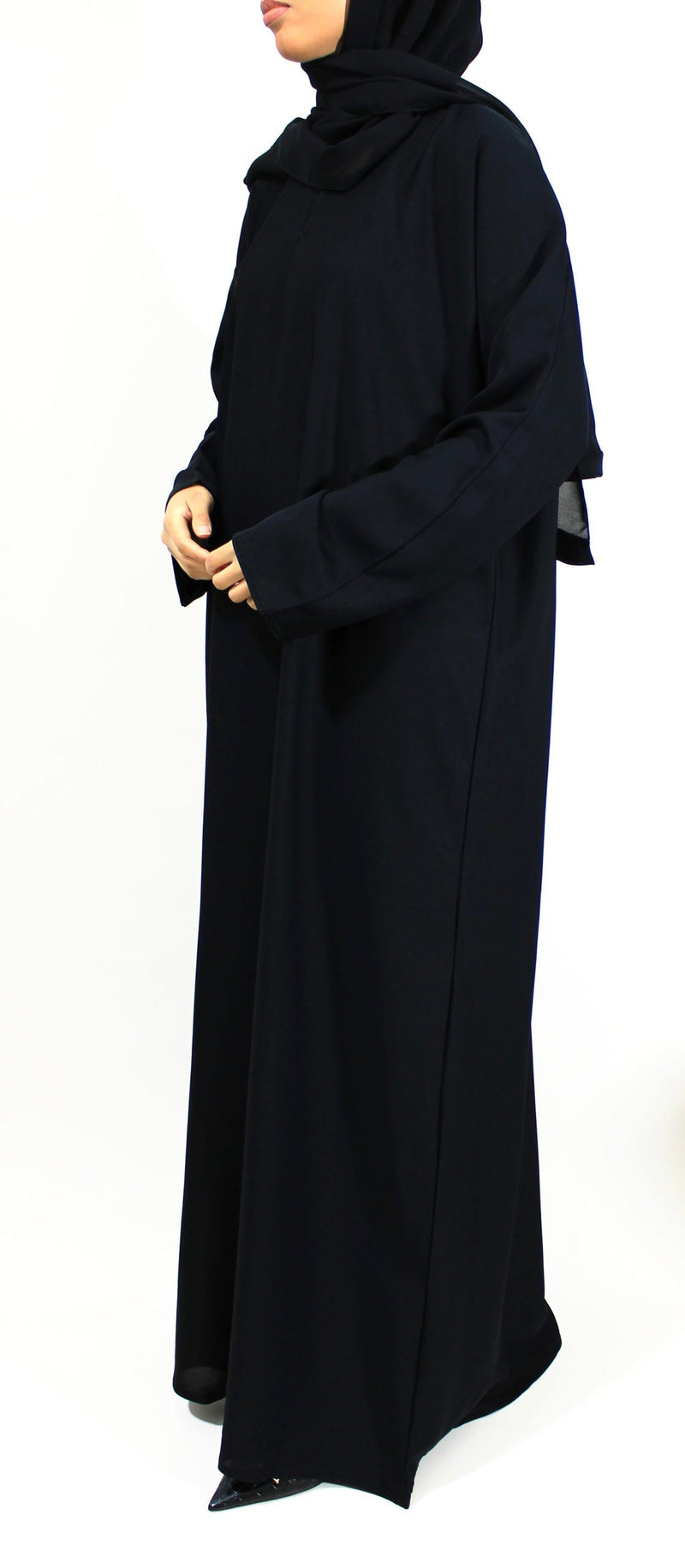
Foto Foto Pashmina Can Give You Ideas — the Real Test Is Whether the Wrap Still Feels Like You
The photograph is lovely: a soft fold beside the cheek, one long end falling cleanly over the shoulder, a colour that seems to make the whole outfit quieter. Then you try something similar at home and discover the part the camera never showed. The scarf shifts when you turn your head. The shoulder end disappears behind your coat. The neat fold presses against your glasses. The front looks generous while you are standing still, then changes the moment you sit down.
That does not mean the photograph misled you, and it does not mean you are bad at wrapping a scarf. A still image simply records one fraction of a second. It can show proportion, colour, mood and a beautiful arrangement of fabric. It cannot show ten minutes of movement, a windy pavement, a train seat, a tote bag strap, a long conversation, a coat collar or the small adjustments that may have happened just before the shutter clicked.
Pashmina photos are useful precisely because they give us ideas. The mistake is asking them to prove more than they can. Instead of trying to reproduce every fold exactly, it is far more helpful to work out what you actually like about the image. Is it the long diagonal line across the chest? The softness around the face? The contrast between a dark dress and a sage scarf? The lack of visible bulk? The way a patterned end is allowed to sit away from the face? Once you can name that, you can keep the part that inspired you and rebuild the rest around your own comfort and coverage.
This guide is about that translation. It is not a promise that one photographic style will suit every scarf, face, outfit or routine. It is a way to look more intelligently at visual inspiration, notice the clues that matter, and test a wrap before trusting it for a full day. If you need the wider background on rectangular pashmina-style scarves, proportions, fabrics and fastening, the complete pashmina head scarf guide covers those foundations in more detail.
Here, the photograph stays where it belongs: as a starting point. Your real life gets the final say.
A photograph gives you a clue, not a verdict
There is a reason we save scarf photographs. One good image can explain a visual idea faster than a page of instructions. You can see that a fuller front drape creates a calmer line with a loose abaya, that a close face frame can make a wide scarf feel less bulky, or that a warm brown looks richer beside cream than it did on a colour chart. Those are useful clues.
What the image cannot tell you is whether the arrangement stayed like that. A scarf can be positioned beautifully for a portrait and still need frequent correction once the wearer starts moving. It may have a hidden pin at the shoulder, a temporary fold tucked behind the neck, a hand holding the lower edge just outside the crop, or a coat that was removed for the picture. None of that makes the photograph dishonest. Photography has always involved arranging what the camera sees. The practical mistake is treating the final frame as a record of every unseen detail.
It helps to separate two questions. First: what do I like here? Second: what would make this workable for me? The first question protects the inspiration. The second protects your day.
You might love a loose side sweep but know that you walk quickly and carry a cross-body bag. You might admire a very smooth forehead line but dislike tight undercaps. You might like a long trailing end but spend much of the day driving. Instead of abandoning the look, keep its visual principle. The loose sweep might become a shorter front drape. The smooth face line might come from a softer single fold rather than tension. The long tail might be shortened or secured where it cannot fall under a strap.
This is the difference between copying and interpreting. Copying asks your body, wardrobe and routine to behave like the photograph. Interpreting asks the photograph to contribute one idea to a life that already exists.
Start by asking what the image is actually showing
Before you judge whether a pashmina look is wearable, slow down enough to describe the picture without adding assumptions. Where can you actually see fabric? Which side is longer? Is the scarf spread wide or folded into a narrow band? Is the neck visible? Can you see the opposite shoulder? Is the back of the head in frame? Does the picture show the whole torso or only the face?
This sounds almost too simple, but it changes the way you read styling photographs. A cropped portrait may give excellent information about the face frame and almost none about chest coverage. A three-quarter photograph can show the shoulder line while hiding how the fabric sits at the back. A seated image may show graceful folds because the model has not yet stood up. A full-length picture can reveal overall proportion but hide the tiny fastening that makes the scarf secure.
Look at posture too. Is the chin slightly lowered? Are the shoulders angled? Is one hand touching the scarf? A hand placed near the collarbone may simply be part of the pose, but it can also temporarily support a drape that would otherwise move. An angled body can make one side appear longer or fuller than it is. If you want to use the picture as a reference, mentally return the person to an ordinary upright position and ask what would change.
Lighting matters in a different way. Soft front light can flatten texture and make layers merge into one another. Strong side light can exaggerate every ridge and make a simple crinkle look more dramatic. Bright backlight can reveal sheerness that a room photograph hides. You do not need to become a photographer to notice these things. You only need to remember that the camera describes fabric under one set of conditions.
Once you have described what is genuinely visible, the image becomes more useful. You stop saying, “I want that exact wrap,” and start saying, “I like the narrow frame, the open front panel and the low shoulder volume.” Those are details you can test rather than fantasies you have to chase.
The camera usually hides the most important practical angles
Most beautiful scarf photographs favour the front or a flattering three-quarter angle. Real life does not. People see you from the side and back. You turn your head, look down, lean over a table and reach for things. If a look is going to feel secure, the unseen angles deserve as much attention as the photographed one.
The back of the head is a good example. A front image may show a wonderfully flat face frame while the rest of the scarf is gathered into several thick layers behind the neck. That can be perfectly comfortable for some women and irritating for others, especially under a hood or against a car headrest. You cannot tell from the front photograph, so treat the missing angle as an unanswered question rather than assuming the back is equally sleek.
The same applies beneath the chin. A smooth front line may be held by a magnet, a pin, a tucked fold or simply friction between the scarf and an undercap. If none of that is visible, do not conclude that the scarf naturally stays in place. When you try the idea yourself, build the security you need rather than feeling that visible support somehow ruins the look.
Chest coverage is particularly easy to overestimate from a crop. A scarf end can look broad near the shoulder but taper quickly lower down. The camera may end just above the point where the panel separates. If front coverage matters to you, the lower edge needs its own test. Look at the entire panel while standing, then again after sitting and moving your arms.
There is also the simple question of length. A photograph may show one dramatic end without revealing where the other end finishes. If you try to reproduce the same distribution with a shorter rectangle, you may pull the scarf too tightly around the head just to gain fabric on the shoulder. That is when inspiration starts costing comfort. The better response is to preserve the line you liked and adapt the amount of fabric to the scarf you actually own.
Read the drape before you copy the colour
Colour is usually the first thing that catches the eye, but drape is often the reason the look works. Two scarves in the same shade can create completely different photographs if one is crisp and the other fluid. Before you go looking for an identical green, brown or pink, notice what the fabric is doing.
Does it fall in long, soft lines or hold rounded folds? Does the edge lie flat beside the cheek or stand slightly away? Is the shoulder panel broad and quiet, or does it collapse into narrow ripples? Does the scarf seem to keep a fold where it is placed? These are clues about behaviour, although a photograph still cannot prove exact fibre, weight or texture.
A very fluid scarf often gives the graceful, falling movement people notice in pashmina inspiration pictures. The same fluidity may mean that it needs more thoughtful support during a busy day. A fabric with more texture may look less polished in a close crop yet stay calmer against an undercap or garment. A denser scarf can create beautiful sculptural folds but feel too bulky if you try to copy a style designed around something thinner.
Instead of buying by colour first, ask what visual behaviour produced the effect you liked. If the image feels elegant because the scarf hangs close to the body, a stiff replacement in the same shade may disappoint. If the image feels cosy because the folds have body, a very thin replacement may look flatter than expected.
This is also where product photographs need a little restraint. A close-up can help you see weave, crinkle, sheen or fringe, but it cannot tell you exactly how the fabric feels on skin or how it changes after washing. Use the image to narrow down possibilities, then rely on clear composition, measurements and care information for the things a photograph cannot establish. Beauty is useful information, but it is not the whole specification.
The wearability triangle is coverage, security and ease
A photo-inspired wrap becomes far easier to judge when you stop asking only whether it looks good. Give it three jobs instead: enough coverage for the way you dress, enough security for the way you move, and enough ease that you can forget about it for long stretches of the day.
Coverage is personal in its exact expression, but it needs to be deliberate. If you want the scarf to add front coverage, the panel has to remain broad enough when you turn, sit and carry a bag. If the garment beneath already gives complete neckline coverage, the scarf may have more freedom to be decorative. The important thing is knowing which layer is responsible for what, rather than relying on a photograph that only shows one position.
Security is not the same as tightness. A wrap that stays put because every layer is pulled firmly can photograph beautifully and still become exhausting. Security can come from a suitable base, a well-placed fastening, a sensible distribution of fabric and fewer loose ends. Sometimes the most stable interpretation of a picture is actually simpler than the photographed arrangement.
Ease is the quality that often gets ignored because it is invisible. Can you turn your head without feeling the scarf drag? Can you put on a coat? Can you answer the phone, put on glasses, eat comfortably and sit against a chair? Can you make wudu privately and rebuild the wrap without a twenty-minute reconstruction? Ease is what allows a style to belong to your life rather than to a single image.
The three jobs affect one another. Extra fabric can increase coverage while reducing ease. A fastening can improve security while creating pressure if it is badly placed. A very loose arrangement can feel effortless while shifting too much. There is no single perfect balance. There is only the balance that lets you feel covered, calm and able to get on with the day.
A wrap can look relaxed while being held very tightly
One of the most deceptive qualities in scarf photography is apparent looseness. A fold may look as if it has simply fallen around the face, yet the hidden layer underneath can be doing a great deal of work. If you copy only what is visible, you may either lose the shape immediately or tighten the entire scarf trying to force it to stay.
Look for signs of hidden tension. A perfectly sharp line beneath the jaw, fabric pulled completely smooth over the crown, or a shoulder panel that seems to defy gravity may suggest that something is supporting the arrangement. Again, that support is not a problem. The lesson is simply that relaxed appearance and relaxed construction are not always the same thing.
When you recreate the idea, start from comfort. Set the face frame with enough room to speak and smile. If the style needs a fastening, place one where it solves the movement instead of compensating with pressure everywhere else. If the scarf keeps sliding because the surface is very smooth, change the foundation or reduce the number of moving layers before you tighten the wrap.
This matters especially when you are drawn to “effortless” photographs. Effortlessness is often the result of careful preparation. The photographer sees the finished line, not the adjustments that created it. Your aim is not to hide all evidence of construction. Your aim is to find the least intrusive construction that gives you the same mood.
A small visible magnet tucked beneath the chin or a discreet shoulder pin is not a styling failure if it lets the scarf remain comfortable for hours. Neither is choosing a slightly fuller face frame because your fabric is thicker than the one in the picture. Wearability is not measured by how convincingly you can pretend the scarf has no mechanics. It is measured by how well those mechanics disappear from your attention once you leave the mirror.
Shoulder volume is where many beautiful looks become awkward
The shoulder is one of the places where a still photograph can be especially persuasive. A broad sweep of fabric creates drama, softens a structured outfit and can give lovely front coverage. It can also collide with almost everything you do with your arms.
Start with the simple question of where the fabric ends. If it falls over the outer shoulder, a handbag or tote strap may drag it backwards. If it crosses the chest diagonally, a cross-body strap may cut through the panel and bunch it. If it sits high near the neck, a coat collar can push it towards the face. The photograph may have been taken without any of those everyday objects in place.
You do not have to lose the sweep. You may only need to lower it, shorten it or anchor it at a point where movement is already happening. Sometimes spreading a narrower section across the chest looks almost identical from the front but behaves better under a coat. Sometimes moving the decorative end to the side that does not carry your bag makes the entire style calmer.
Think about your dominant hand too. If you repeatedly reach across your body, a large panel on that side can shift. If you carry a child, push a pram or use public transport handrails, fabric that floats freely around the shoulder may need more control than a portrait suggests.
The best test is not whether the shoulder drape survives a careful walk across the bedroom. Put on the bag you really use. Reach for something on a high shelf. Sit down, stand up and put on outerwear. If the sweep returns to place or stays acceptably close to it, you have translated the image successfully. If it needs both hands every time you move, keep the visual idea and redesign the route.
The chair test tells you more than another mirror photograph
Standing in front of a mirror encourages fabric to behave. Your shoulders are level, your chin is lifted and your hands are free to make tiny corrections. Sitting removes that advantage. The body changes angle, the lap rises, the shoulders relax and the back of the scarf meets a chair.
That is why a chair is one of the most useful tools for testing a photo-inspired wrap. Sit as you normally would rather than carefully perching. Lean back. Turn to speak to someone beside you. Look down at your phone or a book. Then stand up without touching the scarf. What changed?
A long front end may catch in the lap and pull the face frame. A broad back layer may be pushed forward by the chair. A tucked end can work loose when the torso bends. A decorative shoulder fold may stay perfectly still. You cannot predict every result from the picture because the picture rarely records the transition between positions.
The chair test is particularly useful for weddings, dinners, lectures and journeys, where you may spend far more time seated than standing. A formal wrap that looks beautiful while you greet people should also let you eat and converse without thinking about the scarf every few seconds. A casual wrap for travel should tolerate a headrest and repeated standing.
If the style changes slightly after sitting but remains covered and comfortable, that is not failure. Fabric is allowed to move. The question is whether the movement creates a problem or simply makes the drape look a little less arranged. Real clothing does not have to preserve a studio-perfect line throughout the day. A wearable interpretation has enough structure to stay dependable and enough softness to look natural even after it has lived with you for a few hours.
Glasses, headphones, coat collars and bags belong in the styling decision
Accessories and outerwear are often removed from inspiration photographs because the scarf is the subject. Your day does not remove them. If you wear glasses, headphones, a work lanyard, a backpack, a winter coat or a frequently used bag, those objects are part of the wrap whether or not they appear in the reference image.
Glasses need space at the temples. A photograph with several compact folds beside the face may look very clean on someone who is not wearing frames. Once glasses are added, the same layers can press the arms into the skin or make it awkward to take them on and off. Keep the face line you like, but thin the layers where the frames need to pass.
Headphones create another kind of pressure. Large over-ear cups can disturb a high-volume side style, while earbuds may be easy to use but awkward to reach beneath a very secure under-chin arrangement. If you use them every day, test them before deciding a wrap is effortless.
Outerwear changes the lower half of the scarf. A high zip, hood, lapel or thick collar can lift a soft drape and make it bunch under the jaw. Try the style with the coat closed, not merely hanging open. Then take the coat off again and see whether the scarf remains settled.
Bags are equally revealing because straps create friction. If the inspiration image has a long loose end, decide whether your normal strap will trap it. A simple change of side may be enough. The important thing is to style the scarf with the objects that will actually touch it. A look that only works once everything practical has been removed is a look for a photograph. A look that keeps its character after your glasses, coat and bag are added has a chance of becoming yours.
Borrow the colour relationship rather than the whole outfit
Sometimes the pashmina is not the reason you save a photograph at all. What catches you is the relationship between colours: a muted green against chocolate, a soft ivory beside navy, a warm brown next to cream, or a dusty pink against charcoal. That is good news because colour relationships are often easier to borrow than complete outfits.
Suppose you love a sage scarf in a picture, but you do not own the beige coat or matching dress beside it. Ask what the picture is doing instead of what it is wearing. Sage may be functioning as the softer middle tone between a dark base and a light accent. You can recreate that balance with a navy abaya and an oatmeal layer you already own. The exact garments are not essential.
Warm brown shades such as cocoa, mocha or the milky-brown tones often seen in Indonesian styling images can create the same sense of softness with cream, camel, olive or deep black. A turmeric-like yellow can be beautiful when it is given enough quiet space around it, rather than repeated in several accessories. Blush, mauve and peach can each soften darker outfits, but they behave differently beside the skin and should be checked in your own light.
This approach stops colour inspiration from turning into a shopping list. Save the combination, then look at your wardrobe. Which garment can play the dark role? Which can play the light role? Which scarf gives the small change of colour you liked? You may discover that the feeling of the photograph is already possible with pieces you own.
It also protects you from chasing an exact screen colour. Phone displays, editing and indoor lighting can shift shades considerably. A scarf described as sage may look greyer in person; a brown may be warmer; a pale neutral may pick up pink or yellow. Let the photograph teach you a relationship—soft beside deep, warm beside cream, muted beside black—then judge the actual scarf in real light.
Pattern, texture and shine become louder once fabric is wrapped
A flat scarf photograph can make a pattern look beautifully balanced because you are seeing the whole design. Once that rectangle is folded around the head, the pattern is broken into smaller fragments. One flower may land beside the cheek. A border may suddenly become the strongest line near the face. A woven stripe can repeat several times around the shoulder.
When a patterned pashmina inspires you, look for the part of the design that you want to remain visible. If it is the border, decide whether you prefer it near the forehead, over the shoulder or at the front end. If the whole appeal is a scattered print, a simpler wrap may show it more naturally than several compact layers.
Texture behaves similarly. Crinkle, pleats, fine ribs and brushed surfaces create shadows that are often enhanced by side lighting. In ordinary daylight they may feel subtler. Conversely, a texture that looks delicate in a product image can feel much more present around the face once several layers overlap. You cannot know the sensation from the photograph, so separate visual appeal from skin comfort.
Shine deserves particular care because cameras love reflected light. A glossy scarf can look luminous in event photography, yet the same shine may feel more noticeable in daylight. It may also show every fold or slip more clearly. If you love the photograph because of the glow, ask whether you want that glow for an occasion or whether you want the general colour in a quieter finish for everyday wear.
None of these details makes patterned, textured or shiny scarves difficult by definition. They simply reward editing. Let one interesting surface do the visual work. Keep the wrap clear enough that the fabric can be seen rather than tangled into many small features. The more expressive the scarf itself is, the less you usually need to force the arrangement.
Formal photographs require a different translation from casual ones
Occasion photographs are designed to look composed. The wearer may have spent more time arranging the scarf, chosen a more delicate fabric, used discreet support and remained in controlled indoor spaces. If you copy a formal image for an ordinary working day, the style may feel fussy for reasons that have nothing to do with your ability.
Start by identifying which part makes the image feel formal. It might be cleaner folds, a longer shoulder line, a softly reflective fabric, a decorative edge or simply the way the scarf colour relates to the dress. You may not need all of those elements at once. A matte scarf with a precise drape can look more polished than an elaborate wrap that needs constant attention.
For an actual event, rehearse the image-inspired style with the complete outfit. Add the dress neckline, earrings if you wear them, outerwear and the bag you will carry. Sit at a table. Eat something. Move your arms as you would while greeting family. If prayer will be part of the day, decide in advance how the scarf will fit into that plan. A beautiful arrangement should not turn worship into a clothing emergency.
Casual inspiration works the other way. A loose, relaxed photograph may seem wonderfully easy, but the wearer could be in a calm indoor setting with no wind, coat or long commute. If you want the same feeling for daily wear, keep the softness but add one quiet point of security. The result may look almost identical while behaving much better.
Context is part of style. A wrap does not become more authentic because it is copied exactly from a photograph. It becomes more useful when you understand the environment that made the photograph possible and then rebuild the idea for the environment you will actually be in.
Creator and retailer images are references, not guarantees
We naturally give more authority to an image when it comes from a polished campaign, a well-known creator or a retailer we recognise. The styling may be excellent, but the photograph is still a photograph. It can show how a scarf might look; it cannot guarantee that the same fabric, colour or arrangement will behave identically on you.
Campaign images are often made with deliberate lighting, posing and preparation. Creator photographs may reflect years of personal wrapping experience and a face frame the person can build almost without thinking. Product pictures may be chosen from dozens of frames. None of this is deceptive; it is simply how visual presentation works.
Use those images for what they do well. They can help you compare proportion, see the scale of a pattern, notice how a colour behaves beside another colour and imagine different levels of volume. Then move to factual information for the rest. Check dimensions, composition and care instructions. If a claim about material, origin or quality matters to you, it needs clear evidence beyond the styling image.
This is especially important around words such as premium, original, luxury or best. A photograph can make a scarf look refined. It cannot certify fibre, manufacturing standard, long-term durability or comfort. Packaging, logo placement and gift presentation can be attractive, but they tell you even less about how the scarf will sit around your face at four o’clock in the afternoon.
It is perfectly reasonable to enjoy beautiful branding and presentation. Just keep the decision in the right order. First ask whether the scarf can do the job you need. Then let design, packaging and visual identity add pleasure. When the practical foundation is sound, the beautiful extras feel like extras rather than substitutes for information.
Save inspiration in a way that makes it useful later
A folder full of hundreds of screenshots can become visual noise. You remember that you liked them, but not why. A smaller collection becomes far more helpful when each saved image has a reason attached to it.
You do not need an elaborate system. When you save a pashmina photograph, add a short note with the one feature that mattered: “soft side frame”, “sage with dark brown”, “low shoulder volume”, “pattern kept away from face”, “formal but no bulky crown”, or “front panel stays broad”. These tiny descriptions train your eye to distinguish a useful idea from a general mood.
Then add one practical question. “Would this work with glasses?” “How is the front secured?” “Would my coat lift this?” “Do I have enough width for that panel?” “Is the effect coming from shine rather than colour?” The unanswered question stops you from unconsciously treating the photograph as proof.
If you save several versions of the same idea, compare them. You may realise that every picture you like has a low, soft face frame even though the colours vary. Or that you repeatedly choose one loose shoulder side and one cleaner side. Perhaps the common feature is not the pashmina at all but the calm relationship between a plain scarf and a textured garment.
This kind of small visual library can teach you your own preferences more clearly than trying every new style that appears on your screen. It also makes shopping more disciplined. Instead of looking for “a beautiful pashmina”, you know that you need a scarf capable of a broad front panel without much bulk, or a muted colour that works with three garments already in your wardrobe.
Inspiration becomes powerful when it turns vague admiration into a useful observation.
Re-create the feeling, not the exact arrangement
The most satisfying interpretations often look less like copies and more like relatives of the original. You keep the element that moved you and allow everything else to change. That is not compromising the idea. It is making the idea yours.
If you loved the airy feeling of a photograph, the answer might be fewer folds rather than the same scarf. If you loved the long line across the chest, you can create that line with a shorter, more secure panel. If you loved the colour, your own wrap can be completely different. If you loved the clean face frame, you may discover that a slightly softer curve works better with your glasses and still gives the same calm impression.
This is especially freeing when your scarf has a different weight or width. Trying to force a dense rectangle into the tiny folds of a very light scarf usually creates frustration. Let the denser fabric have broader, fewer folds. A narrower scarf may not give the same chest panel, so use the garment beneath for complete coverage and let the scarf carry only the visual line you liked.
Your face, shoulders, height and everyday posture also change proportion. A shoulder sweep that ends at one point on the person in the image may sit higher or lower on you. Adjust until the line looks balanced on your body rather than using the photograph as a ruler.
There is a deeper relief in this way of dressing. You stop asking, “Why doesn’t it look exactly like hers?” and start asking, “What is this idea doing for me?” That question leaves room for modesty, comfort and personality at the same time. A photograph can introduce you to a possibility. It does not need to become a standard against which your face or body is measured.
Give every photo-inspired wrap a five-minute home test
Before trusting a new arrangement for work, an event or a long day out, give it five ordinary minutes at home. The point is not to stress-test the scarf like equipment. It is simply to reveal the problems a still picture could never show you.
Begin with three views: front, side and back. Use a second mirror or a quick phone picture if needed. Check whether the neck and upper chest sit the way you intended and whether the back has more bulk than you realised. Then turn your head fully left and right. Look down, smile, speak and open your mouth comfortably. If the frame pulls, loosen the construction before doing anything else.
Next, sit on a normal chair and lean back. Stand up without touching the scarf. Reach both arms forward and then above shoulder height. Put on your usual coat or cardigan. Add your glasses and bag if they are part of the day. The entire sequence takes only a few minutes, but it tells you whether the photographed idea has survived contact with your routine.
If you are planning to be photographed at an event, check the scarf in different light as well. A pale layer may look more transparent against a contrasting undercap. A reflective fabric may become much brighter under flash. This is not about chasing photographic perfection; it is about avoiding surprises when the same scarf is seen under several conditions.
Finally, leave the room and do one small task. Make tea, tidy something, answer a message. When you return to the mirror, notice whether you were constantly aware of the scarf. If you had to touch it every minute, the style needs simplifying or better support. If you forgot about it and the important coverage remained where you wanted it, the photograph has successfully become clothing.
Know when a photograph should remain inspiration only
Some looks are worth admiring without recreating. That is not a defeat. We do this with architecture, cakes, interiors and fashion all the time: something can be beautiful and still be wrong for our own space, routine or needs.
A wrap may rely on more looseness around the neckline than you prefer. It may use a very long trailing end that would annoy you at work. It may have large volume near the ears when you wear glasses all day. It may be built from a fabric that you know irritates your skin. The image can still teach you about colour, proportion or mood even if the full arrangement never belongs in your wardrobe.
There are also photographs that depend on a precise pose. If the scarf only looks balanced when the chin is turned to one side or a hand is holding the edge, keep the composition as visual inspiration rather than forcing it into a functional style. You might borrow the colour combination or the idea of one asymmetrical line and leave the unstable construction behind.
The same is true when practical information is missing. If a listing gives beautiful images but no trustworthy measurements or composition, you can appreciate the styling without making assumptions about the product. A picture is not obliged to answer every question, but you are not obliged to buy before those questions are answered.
Knowing when not to copy something is part of developing personal style. It means you can enjoy what other women wear without turning every beautiful image into a demand on yourself. Inspiration should widen your possibilities, not narrow your sense of what is acceptable until only one photographed version feels right.
A small image folder can make your own style clearer
After a few weeks of saving intentionally, patterns begin to appear. You may notice that you almost always choose scarves with quiet face frames and more interest at the shoulder. Perhaps you are drawn to earthy colours in winter and cooler muted shades in summer. Maybe formal pictures attract you because of clean lines, not because of embellishment. Those repetitions are useful clues about your own taste.
They can also reveal what you do not enjoy. If every saved photograph with a high bulky crown remains something you admire but never wear, you can stop trying to make that feature work. If patterned scarves appear in your folder only when the pattern is kept away from the face, that tells you how to use prints more comfortably. Personal style often becomes clear through these small exclusions.
The result is not a rigid uniform. It is a vocabulary. You learn that you like one long diagonal, a softer forehead line, low volume near glasses, tonal colour combinations, or one stronger shade against a plain abaya. Once you have that vocabulary, new photographs become easier to evaluate. You can tell within seconds which part is relevant to you and which part belongs to someone else’s preferences.
This is particularly helpful when trends move quickly. New scarf arrangements, creator looks and colour combinations will always appear. You can enjoy them without rebuilding your wardrobe every week because you already know which ideas fit your way of dressing. A new photograph becomes an invitation to notice, not an instruction to change.
There is confidence in that. The goal is not to become immune to inspiration. It is to become selective enough that inspiration serves you. Your folder should eventually look less like a catalogue of people you want to imitate and more like a set of visual notes about the woman you already know how to dress.
Wearability is what remains after the picture is over
The most useful pashmina photograph is not necessarily the most dramatic one. It is the one that gives you an idea you can carry into your own day: a calmer line, a new colour relationship, a better distribution of fabric, a softer way to frame the face or a reminder that beautiful coverage does not need endless complexity.
Once you have taken the idea, let the photograph go. Your scarf has different measurements. Your fabric may be lighter or denser. Your face frame has to work with your glasses, your skin and the way you move. Your outerwear, bag, work and worship all belong in the final decision. None of those realities makes your version less elegant.
A good wrap should give you enough confidence to stop checking it. That may mean one discreet fastening where the photograph looked completely loose. It may mean a shorter shoulder end, a broader front panel or fewer folds near the cheek. These are not corrections to an imperfect copy. They are signs that you understood what the picture could offer and what it could not.
Modest dressing has always involved more than a frozen silhouette. It is clothing in motion: walking, sitting, greeting, praying, travelling, working, caring for people and moving between private and public spaces. A scarf that supports those things has achieved something a perfect photograph cannot show.
So save the beautiful image. Notice exactly what drew you to it. Borrow that piece with gratitude. Then test the wrap in the ordinary conditions of your own life. The best result may not be the one that looks identical on your screen. It is the one you can actually wear and then, for most of the day, forget that you are wearing.
Your own quick photos can reveal what the inspiration image cannot
There is a useful difference between taking a picture because you want to look polished and taking one because you want information. A quick front, side and back photo of your own wrap can show details that are surprisingly hard to see in a mirror. You may notice that one side has crept higher, that a broad panel narrows once it reaches the chest, or that the back has gathered into more fabric than you expected.
Do not turn this into a hunt for tiny imperfections. The purpose is practical. Ask only whether the arrangement is doing the jobs you gave it. Is the coverage where you intended it to be? Is the volume comfortable? Does the side view explain why the scarf catches on your coat? Does the back view show an end that could be tucked more securely? One useful observation is enough.
A short video can be even more revealing. Place the phone safely, walk a few steps, sit, stand and turn your head. You do not need to share it with anyone. The movement may show that a style you thought was unstable actually settles beautifully, or that a neat shoulder fold swings loose every time you reach. That is information a posed reference image could never give you.
Be careful with comparison while you do this. Your home lighting, camera height, scarf and body are different from the image that inspired you. The purpose is not to place the two pictures side by side and decide which woman looks better. It is to see whether the visual idea has become functional in your own version.
Once you have the answer, delete the test pictures if you want. They have done their job. The real measure of success comes later, when you leave the house and realise you have spent the last hour thinking about your day rather than your scarf.
It can also help to repeat the same test on a different day instead of endlessly adjusting one version in a single sitting. Fabric behaves differently after it has been folded, worn under outerwear or handled for a while, and your own patience changes too. If a simple arrangement keeps working without special effort, that consistency is valuable. A style that needs perfect lighting, perfect posture and constant rebuilding may still be beautiful for a photograph, but you now know exactly where it belongs.
Frequently asked questions about pashmina photo inspiration
Can I copy a pashmina style exactly from a photo?
You can use a photograph as a reference, but an exact copy may behave differently because scarf size, fabric, face shape, underlayers and daily movement all change the result. Identify the feature you like most, then adapt the construction so it feels secure, covered and comfortable on you.
How can I tell whether a pashmina photo shows enough chest coverage?
A cropped image cannot prove full front coverage. Look for a full-torso view if one is available, then test your own scarf while standing, sitting and turning. If chest coverage matters to you, judge the whole panel in movement rather than relying on how broad it looks near the shoulder.
Why does my pashmina look bulkier than the one in the picture?
The photographed scarf may be thinner, narrower, more fluid or folded differently. Lighting can also make layers look flatter. Instead of tightening or compressing your scarf excessively, use fewer folds, reduce hidden layers and let a denser fabric form broader shapes that suit its natural body.
What should I notice first in a pashmina inspiration photo?
Start with structure rather than colour. Notice the face frame, how much fabric sits at each shoulder, whether the front panel is spread or folded, and which angles are missing. Then look at colour, pattern and finish. This makes the image easier to translate into a practical wrap.
How do I make a photo-inspired pashmina style work with glasses?
Leave less bulk at the temples and test the frames before finishing the wrap. Put your glasses on and take them off several times, then turn your head. Keep the visual line you liked from the picture, but adjust the side folds so the frame arms do not press or catch.
Can product photos tell me whether a pashmina scarf is good quality?
They can show colour, pattern, finish and some aspects of construction, but they cannot prove fibre content, comfort or long-term durability. Use photographs as visual evidence only, and rely on clear composition, measurements, care information and other factual details for practical decisions.
How can I use pashmina colour photos without buying a whole new outfit?
Borrow the colour relationship rather than the exact pieces. Notice whether the scarf is acting as a soft middle tone, a light contrast or the strongest colour in the look. Then recreate that balance with garments you already own, even if the exact shades and silhouettes are different.
What is the quickest way to test whether a pashmina wrap is wearable?
Give it a short movement test at home: check the front, side and back, turn your head, sit and stand, reach with both arms, add your coat, glasses and bag, then do one ordinary task without adjusting the scarf. If important coverage stays in place and you can forget about it, the style is promising.