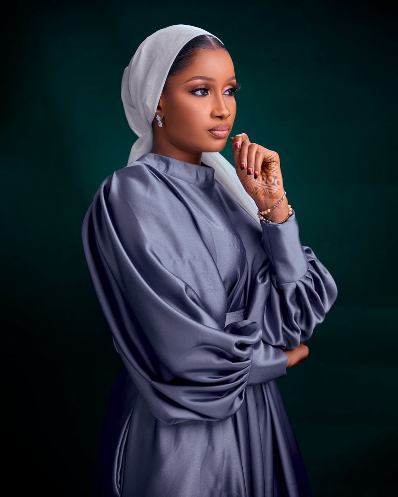
Purple Khimar Styling Can Make Your Face Glow — or Let the Colour Arrive Before You Do
Purple looks simple until it is wrapped close to the face. On a hanger, it can look soft, rich, playful or elegant. Once it becomes a khimar, the colour starts doing more than decorating the outfit. It sits around the cheeks, under the chin, across the shoulders and over the chest, so every small shift in undertone, depth and fabric surface becomes easier to notice.
That is why a purple khimar should not be chosen only because the shade looks pretty in a photograph. It has to work with the face, the abayas already in the wardrobe, the level of contrast you like, the places where you will wear it and the amount of attention you are comfortable carrying. A beautiful purple can look graceful and expensive. The wrong purple can feel strangely loud, dull, cold or disconnected from everything else.
This is not about turning colour into a rule book. It is about making a gentle decision before the khimar becomes part of daily modest dressing. If you already understand the basic shapes, lengths and coverage choices in a complete khimar guide, purple becomes the next question: which version of the colour will actually frame you well?
Purple is not one colour once it touches the face
The first mistake is treating purple as one family with one effect. Lilac, lavender, mauve, violet, plum, aubergine, berry and raisin can all sit under the same colour name, but they behave very differently once they are close to the skin. Some brighten the face. Some cool it down. Some add richness. Some make the outfit feel formal before anything else has been added.
A pale lilac can look airy and delicate, but it can also wash the face out if it is too cool or too thin. A dusty mauve can feel soft and grown-up, especially with beige, taupe or brown layers. A blue-violet can look elegant with grey, navy and black. A plum or aubergine khimar can bring depth to a simple abaya, but it needs enough softness in the fabric so it does not feel heavy around the head.
This is why the best purple is rarely chosen by shade name alone. The name tells you the direction. Your skin, wardrobe and routine decide whether it is right. A colour can be fashionable and still not be useful. It can be unusual and still become one of the easiest pieces you own. Purple rewards attention because it changes character more quickly than black, cream, brown or navy.
Before buying, ask what you want the colour to do. Do you want it to soften a plain black abaya? Add richness to cream? Make a brown outfit feel more feminine? Create a quiet occasion look? Give your usual layers a little lift without becoming bright? The answer will point you towards a very different purple each time.
Undertone matters more than the word purple on the label
Undertone is the hidden reason one purple looks calm and another looks difficult. A cool purple leans towards blue, grey or silver. A warm purple leans towards red, brown or berry. A neutral purple sits somewhere between the two. Because a khimar frames the face so closely, this undertone can change how the skin appears in a way that a purple bag or shoe would not.
If you usually feel good in navy, charcoal, soft white, grey, silver or blue-based colours, cool lavender, violet, smoky purple and grey-lilac may feel natural. They can sharpen the outfit without looking heavy. If you usually feel better in cream, camel, brown, olive, warm beige, rose gold or gold, warmer mauve, raisin, berry and plum may sit more kindly beside your face. They often add richness without making the complexion look drained.
This is not a strict personal-colour system. Real wardrobes are messier than colour charts, and many women can wear more than one direction. The useful point is to notice what happens near the face. Does the purple make your skin look clearer? Does it make the under-eye area look shadowed? Does it make your abaya look sharper or softer? Does it fight your usual neutrals?
A purple khimar becomes easier to style when the undertone already belongs to you. You will not need to rescue it with extra makeup, a complicated abaya or a different undercap every time. It will simply sit better. That quiet ease is usually what makes a colour look expensive, even before anyone notices the fabric.
Light purple needs opacity before it can look delicate
Light purple can be beautiful, especially in lilac, lavender and soft orchid shades. It has a gentleness that can make a modest outfit feel fresh without becoming playful. The difficulty is that pale purple shows fabric weakness quickly. If the khimar is too thin, too clingy or too transparent, the colour can stop looking delicate and start looking unfinished.
Opacity is the first test. Because light purple does not hide shadows as easily as black or dark plum, the undercap, hairline, layers and seams may show more than expected. A khimar that looks fine flat may appear weaker when stretched around the face or layered over the shoulders. The more modest coverage you need, the more important fabric density becomes.
The second test is surface smoothness. A pale purple with a slightly fuzzy surface can catch lint and look tired quickly. A very shiny pale purple can look too sweet or bridal if the rest of the outfit is not planned. A matte fabric with a soft drape is often easier. It allows the shade to remain gentle without looking fragile.
Light purple also needs thoughtful pairings. It can look graceful with cream, soft grey, taupe, white, muted beige or a gentle brown. It can look harsh with stark black if the contrast is too sharp for your colouring. That does not mean black is forbidden; it means the shade and fabric have to be strong enough to handle the contrast.
Dusty mauve is often the easiest purple for real life
Dusty mauve sits in the space between colour and neutral. It has enough purple to feel feminine and considered, but enough softness to avoid looking loud. For many wardrobes, this is the shade that moves most easily from errands to family visits, classes, work, school runs, quiet dinners and masjid days. It does not demand a special outfit before it makes sense.
The beauty of mauve is that it usually softens hard contrasts. With black, it can reduce severity. With cream, it can feel warm and polished. With brown, it can look rich without being heavy. With taupe or stone, it can create a tonal outfit that feels calm rather than flat. It is especially useful for women who want colour but do not want the colour to become the whole personality of the outfit.
Not every mauve is equal. Some mauves lean pink and can feel sweet. Some lean grey and can feel cool. Some lean brown and look almost like a muted berry neutral. The most wearable version is usually the one that connects with your existing wardrobe. If your abayas are warm, choose a mauve with a little warmth. If your wardrobe is cool, choose one with a smoky or grey edge.
A dusty mauve khimar can also make simple dressing feel more intentional. A plain abaya, simple shoes and minimal accessories can look complete because the colour has quiet depth. It is a useful choice for women who want modest outfits to feel gentle, not decorative. The shade does the work softly.
Plum and aubergine bring richness, but the fabric must still move
Deep purple shades such as plum, aubergine, raisin and berry can look expensive very quickly. They carry depth, especially beside cream, black, brown, charcoal and navy. They can also feel more grown-up than lilac or bright violet. For women who enjoy darker modest outfits but want something softer than black, this part of the purple family can be especially useful.
The risk is weight. A deep purple khimar in a stiff or thick fabric can look heavy around the head and shoulders. Instead of framing the face, it can close in on it. The colour may be beautiful, but if the fabric does not fall cleanly, the whole look can feel dense. A deep shade usually needs drape, softness and enough air in the silhouette.
Depth should not be confused with shine. Some dark purples become harsh when the fabric is too glossy, especially in strong daylight or under indoor lighting. A little sheen can be elegant for occasions, but heavy shine can make the khimar look more formal than intended. A matte or lightly textured plum often looks richer because it allows the colour to hold shadow in the folds.
Deep purple works best when the rest of the outfit gives it space. A plain black abaya, cream underlayer, brown outer layer, dark green coat or charcoal dress can let the colour lead without crowding it. If everything else is embellished, printed or shiny, plum can become too much. Rich colour needs calm companions.
Bright violet needs restraint around it
Bright violet is not wrong. It can be beautiful on the right woman, especially when she enjoys clear colour and has a wardrobe that can support it. The problem is that bright violet has presence. If the khimar is vivid, the outfit has to acknowledge that instead of pretending it is a neutral. Otherwise the colour can look accidental.
The easiest way to wear a brighter purple is to simplify everything around it. Choose a plain abaya, calm shoes, a quiet bag and minimal jewellery. Let the khimar be the colour decision. If you add a printed abaya, a bright bag, shiny details and strong makeup at the same time, the eye has nowhere to rest. The khimar may be blamed, even though the real problem is too many competing choices.
Fabric can calm bright violet. Matte crepe, soft woven textures or a slightly brushed surface can make a vivid shade feel more dignified. Thin shine can make it look sharper. Very light fabric can make it look unstable. If you want the clarity of violet but not the loudness, look for a version with a little dustiness or depth rather than a flat, intense purple.
Bright colour also has to match your confidence. Some women feel more themselves when colour is visible. Others feel distracted all day. Modesty does not require you to avoid colour, but it also does not require you to perform boldness. Choose the level of purple you can wear without constantly thinking about it.
Fabric depth is what makes purple look expensive
Depth is the difference between a purple that looks rich and a purple that looks flat. It comes from the way the fabric holds colour through folds, movement and shadow. A good purple does not look like one solid block. It has variation as the khimar moves. The edge may look slightly darker, the draped area softer, the layered part deeper. That variation is what gives the shade life.
Thin fabric can flatten purple because there is not enough substance for the colour to settle into. It may look bright where light passes through and dull where it overlaps. Very smooth synthetic shine can also flatten the colour by reflecting light from the surface instead of allowing the shade to feel layered. A matte fabric with a little texture often gives purple more elegance.
Texture does not have to mean roughness. A fine crepe-like surface, a soft woven feel or a subtle grain can make the colour look more considered. It also helps hide minor creases and surface marks better than very glossy fabric. This matters because purple can show imperfections in a different way from black or navy. A snag, shine mark or crease may interrupt the richness of the shade.
Before choosing, look closely at how the fabric behaves around folds. If the purple becomes more beautiful where it drapes, that is a good sign. If it looks patchy, see-through or overly shiny in folds, the colour may not feel as expensive in real life. Fabric depth is not a luxury detail. It is part of the colour itself.
Matte, sheen and texture change the mood of the same shade
The same purple can look modest, formal, playful or severe depending on the surface. A matte dusty mauve may feel calm enough for everyday wear. A shiny mauve may feel more occasion-based. A textured plum may look rich and grounded. A glossy plum may feel dramatic. The colour name stays similar, but the mood changes completely.
Matte fabrics are often the easiest for daily use because they reduce glare near the face. They let the shape, coverage and colour work quietly. A matte purple khimar can pair well with plain abayas and does not usually need much styling. It is also more forgiving if you prefer simple outfits and minimal accessories.
Sheen can be beautiful, but it needs intention. A satin-like purple may look lovely for an evening gathering, Eid meal or family occasion, but it may feel too much for a normal errand day. Shine also reflects light onto the face, which can change how the undertone reads. A cool shiny purple may become sharper. A warm shiny purple may become richer, but also more formal.
Texture gives purple grounding. It can stop lilac from feeling too sweet, make violet less loud and make plum more expensive. The key is comfort. A textured khimar still needs to feel soft enough around the face and stable enough through the day. If texture scratches, clings or distorts the drape, the look may be interesting but not wearable.
The face opening decides whether the colour frames or overwhelms
A khimar does not sit away from the face like a loose scarf thrown around the shoulders. Its face opening, undercap line and fall all affect how much colour appears near the cheeks and forehead. A purple that looks gentle in a small amount may feel stronger when it surrounds the whole face. This is why shape and colour have to be judged together.
If the opening is close and neat, the shade becomes more concentrated. That can be flattering with soft mauve, smoky violet or deep plum, but it can be intense with a bright purple. If the opening is wider or softer, the colour may feel more relaxed, especially when the undercap provides a break. Both shapes can work; they simply change how the shade behaves.
Undercap colour plays a quiet role. A black undercap can sharpen purple. A cream or beige undercap can warm it. A grey undercap can cool it. A matching purple undercap can look polished if the match is right, but awkward if the undertones are slightly different. With light purple especially, the undercap may show through or change the colour at the edge.
Face framing should feel kind. If the purple creates shadows, makes you feel washed out or draws attention to the edge instead of the whole look, try a different undertone, fabric or undercap before giving up on the colour. Sometimes the shade is right but the frame is wrong.
Pairing purple with black can be elegant or too sharp
Black is the easiest abaya colour to reach for, and it can work beautifully with purple. Plum with black can look rich. Violet with black can look clear and confident. Dusty mauve with black can soften the whole outfit. But black also increases contrast, so it can make certain purples look brighter, colder or more dramatic than expected.
If the purple feels too sharp with black, try changing the texture before changing the colour. A matte khimar may calm the contrast. A softer black abaya fabric may help. A cream or taupe layer underneath can reduce the hard line. Shoes and bags in softer neutrals can also make black and purple feel less severe.
Pale lilac with black is the most sensitive pairing. It can look crisp and elegant on some women, but it can also feel harsh if the lilac is icy or the fabric is thin. A grey-lilac or slightly dusty lavender may be easier than a very pale, clean purple. The difference is small in a photo but clear when worn.
Black should be a support, not an automatic answer. If every purple you try feels wrong with black, test it with charcoal, cream, brown, taupe, navy or olive. The problem may not be purple at all. It may be the level of contrast created by the black layer underneath.
Cream, taupe and brown can make purple look softer
Warm neutrals are some of the most beautiful companions for purple. Cream, taupe, stone, camel and brown can make purple feel less sharp and more expensive. They are especially helpful with mauve, plum, raisin and warm berry shades. Instead of creating a hard contrast, they let the colour settle into the outfit.
Cream can lift deep purple without making it loud. A plum khimar with a cream abaya or cream underlayer can feel elegant and feminine. Taupe can make dusty mauve look almost tonal, which is useful for women who prefer quiet outfits. Brown can add depth and maturity, especially with warmer purples that have a berry or raisin undertone.
The key is avoiding near-matches that are slightly wrong. A cool lilac with a very yellow cream may look disconnected. A warm mauve with a cold grey-taupe may feel muddy. If the outfit looks off, it may not need more colour; it may need the neutral to shift warmer or cooler.
Brown and purple can be particularly graceful when both are muted. Chocolate, mocha, espresso, mushroom and warm taupe all offer different levels of depth. They can make the khimar look chosen rather than added. This is one reason a purple khimar can become easier than expected in a wardrobe built around earthy modest colours.
Navy, grey and charcoal make cool purples feel grown-up
Cool purples often look strongest with cool neutrals. Navy, grey and charcoal give violet, lavender and smoky purple a calm base. They can make the outfit feel polished without the contrast of black. For women who find black too severe but still want a refined look, these pairings are worth testing.
Navy is softer than black but still structured. It works well with blue-violet, lavender, smoky plum and grey-lilac. A navy abaya or coat can make purple feel intentional without making the outfit too dark. It also suits women who already wear cool-toned hijabs, silver accessories or blue-based colours.
Grey can be elegant, but it needs the right purple. A very cold grey with a very pale lilac may look washed out. A charcoal grey with violet or plum can look more grounded. Soft mid-grey with dusty lavender can feel gentle and modern. The fabric surfaces matter here too; too much flatness can make the outfit dull.
Charcoal is a useful middle ground. It has depth but not the sharpness of black. It can make a purple khimar look more expensive because it gives the colour room to show its undertone. If your purple feels too bright with black and too delicate with cream, charcoal may be the missing companion.
Olive and green can work when the purple is chosen carefully
Purple and green can look beautiful together, but the pairing needs restraint. Olive, sage, khaki and muted green can bring out the richness of mauve, plum and berry shades. The effect can feel earthy and feminine rather than colourful. The danger is choosing two strong colours that compete instead of supporting each other.
Muted olive with dusty mauve is one of the easiest combinations. It feels calm because neither colour is shouting. Deep plum with dark olive can look rich, especially in matte fabrics. Sage with lavender can feel fresh, but it can also look pastel if both shades are too light. Balance comes from choosing one shade to lead and one to support.
If the abaya is green, the khimar should usually be quieter. If the khimar is bright purple, the green should be more neutral or deeper. Avoid adding too many extra colours through shoes, bag and underlayers. Purple and green already create interest. The rest of the outfit can stay simple.
This pairing is also sensitive to season. Olive and plum can feel autumnal. Sage and lavender can feel spring-like. Deep green and aubergine can feel formal. None of that is a problem, but it affects how wearable the outfit feels in daily life. Choose the version that suits your actual routine.
Prints need one clear leader when purple is involved
A printed abaya can work with a purple khimar, but the outfit needs a leader. If the print is bold and the khimar is bold, the look can become crowded. If the print is subtle and the khimar is calm, the result can be elegant. The question is not whether print is allowed; it is whether the colours and scale speak at the same volume.
If the print contains purple, choose a khimar that either matches the undertone clearly or sits as a deliberate contrast. A near-match that is slightly too blue, too pink or too bright can make the outfit look accidental. If the print contains warm florals, a warm mauve or plum may be better than cool violet. If the print contains greys and blues, smoky lilac or blue-purple may make more sense.
If the print does not contain purple, keep the abaya colours calm. Black-and-cream prints, taupe patterns, soft florals and muted geometric details can all work. Loud multi-colour prints are harder because the purple khimar adds another strong element. In modest dressing, a clean outfit often feels more graceful than a busy one.
Texture follows a similar rule. A textured abaya with a textured khimar can be beautiful if both are subtle, but messy if both are strong. If one fabric is richly textured, let the other be quieter. Purple already has character. It does not need every other detail to compete for attention.
Occasion styling should add polish without turning the khimar into costume
For Eid, a dinner, a family gathering or a special visit, purple can feel more memorable than a neutral. The temptation is to keep adding detail because the colour already feels dressy. In reality, the most elegant occasion outfit often begins with restraint. A rich purple khimar, clean abaya shape and one beautiful detail may look more expensive than a full set of competing embellishments.
Deep plum, aubergine and berry shades usually handle occasion dressing well. They pair with cream, black, chocolate, navy and dark green. A subtle sheen may be suitable if the rest of the outfit is calm. Soft mauve can also be beautiful for occasions when the aim is gentle rather than dramatic. Lilac can work, but the fabric needs enough opacity and structure so it does not look too casual or fragile.
Accessories should support the shade. Gold-toned details can warm mauve and plum. Silver-toned details can cool lavender and violet. Pearls can soften pale purple. Neutral bags and shoes keep the look grounded. A purple bag is not necessary, and it can look forced if the colour is almost but not quite the same.
Occasion styling should still respect comfort and coverage. If the khimar slips, clings, shines too much under lighting or feels heavy after an hour, the outfit will not feel graceful. A special look is still worn by a real person moving, sitting, greeting family and praying when needed. Beauty should not cancel ease.
Everyday purple needs to survive ordinary movement
An everyday purple khimar has a different job from an occasion piece. It has to work when the outfit is not perfectly styled. It has to sit neatly during errands, school runs, study, work, shopping, travel and family days. It has to make a plain abaya look better without making you feel dressed up beyond the moment.
For this, muted shades usually win. Dusty mauve, smoky lavender, grey-lilac, raisin and soft plum can become everyday colours because they do not demand too much. They work with plain shoes and simple bags. They do not need a matching outfit. They can be repeated without feeling as noticeable as bright violet.
Fabric practicality matters more in daily wear. The khimar should be comfortable around the neck, stable at the face opening and easy enough to care for. If it creases badly, catches lint, needs constant steaming or shows every mark, the colour may become a burden. Everyday modest clothing should make life easier, not more fragile.
A good everyday purple will make you feel a little more finished without making the outfit complicated. It should be the piece you reach for because it softens black, warms brown, lifts cream or brings depth to charcoal. That quiet usefulness is what makes it worth keeping.
Masjid and worship settings call for calm colour choices
A purple khimar can be suitable for the masjid when the shade, fabric and coverage feel respectful. Colour itself is not the issue. The question is whether the khimar feels calm, opaque, secure and free from distracting shine or excessive decoration. A muted plum, dusty mauve, smoky violet or soft lavender can sit beautifully in worship settings when the rest of the outfit is simple.
For salah, movement matters. The khimar should stay in place during bowing and prostration, cover as intended and not require constant adjustment. A pretty shade becomes frustrating if the fabric slips forward, pulls back or exposes areas you expected it to cover. The garment still has to do its modest function before the colour can matter.
Shine deserves caution in worship spaces. Bright lighting can make glossy purple more noticeable than it looked at home. Thin fabrics can become more revealing when layered over lighter clothing. Heavy fabrics can feel uncomfortable through longer prayers or busy masjid days. The right choice is usually the one that lets you stop thinking about the outfit.
If you want purple for the masjid, choose dignity over display. Let the shade be beautiful, but keep the outfit clean. A plain abaya, secure undercap and comfortable fabric will make the colour feel peaceful. The khimar should help you feel covered and settled, not self-conscious.
Season changes how purple feels in an outfit
Purple can behave differently across the year. Pale lilac and lavender often feel lighter in spring and summer, especially with cream, white, soft grey and beige. Dusty mauve works almost all year because it sits between soft and grounded. Plum, aubergine and raisin feel richer in autumn and winter, particularly with brown, charcoal, black, navy and coats.
Season is not a rule, but it helps explain why a shade may feel easier at one time than another. A deep plum khimar can feel beautiful with a winter coat but heavy with a lightweight summer abaya. A pale lavender can feel fresh in warm weather but too delicate with thick dark layers. If a purple feels wrong, consider whether the season is affecting the outfit.
Fabric also changes by season. Lightweight fabric needs opacity in pale shades. Heavier fabric needs movement in deep shades. A textured purple can feel cosy in cooler months, while a smoother matte fabric may be easier in warmer weather. The most useful purple khimar is one whose colour and fabric belong to the way you actually dress through the year.
Seasonal thinking also prevents overbuying. Instead of collecting many similar purples, you might choose one light soft shade and one deeper rich shade. That gives you range without turning the wardrobe into a colour experiment. Purple is memorable, so a few well-chosen pieces can do more than many almost-right ones.
Shopping online means reading the colour through clues
Online photos are helpful, but purple is easily changed by lighting, editing and screen settings. A shade may look cooler on one device and warmer on another. Studio lights can make lilac appear brighter. Shadows can make plum look almost black. A product image can show the general idea, but it cannot guarantee how the colour will sit beside your face.
Read every clue available. Look at the shade beside the model’s skin, the background, the abaya and any other colours in the frame. If the white background looks blue, the purple may be warmer in reality. If black looks washed out, the whole image may be over-brightened. If the same khimar looks different across several photos, pay attention to the range rather than trusting one image.
Descriptions help, but they are not perfect. Words such as lilac, plum, mauve or violet are useful starting points, not measurements. A brand’s mauve may be another brand’s dusty rose. A plum may be deep berry or nearly aubergine. Instead of relying only on the name, check undertone, opacity, fabric surface and how the colour appears in folds.
Before adding to basket, compare the shade with clothes you already own. Imagine it with three real outfits, not a fantasy outfit. If it works with a black abaya, a cream or taupe layer and one everyday outfit, it has strong potential. If it only works with a single special outfit, decide honestly whether that is enough.
Use your wardrobe as the test, not the product photo
The best purple khimar is not the one that looks most dramatic alone. It is the one that makes sense with your actual wardrobe. If your abayas are mostly black, you can choose more contrast, but you still need to decide whether the purple should be soft, rich or bright. If your wardrobe is mostly warm neutrals, mauve, berry and plum may be easier. If it is mostly cool neutrals, lilac, violet and smoky purple may fit more naturally.
Look at your most-worn pieces first. The abaya you reach for on tired mornings matters more than the special outfit you wear twice a year. If a purple shade works with your everyday black, brown, navy or cream pieces, it will probably be used. If it only works with one carefully planned outfit, it may sit untouched no matter how pretty it is.
Also consider your coat, shoes and bag colours. A khimar sits near the face, but the full outfit includes everything else. Purple with a black abaya and tan shoes feels different from purple with a black abaya and black shoes. Purple with a cream dress and brown bag feels different from purple with a cream dress and silver accessories. These small details decide whether the outfit feels complete.
Wardrobe testing makes colour less emotional. Instead of asking whether purple is beautiful, you ask whether this purple has a place. That is a calmer question, and it usually leads to better buying decisions. The colour should serve the clothes you already wear, not demand a new wardrobe around it.
Length and coverage still matter more than the shade
It is easy to become absorbed in colour and forget the garment itself. A khimar still needs to cover in the way you expect. It needs the right front length, back length, width, face opening and movement. A beautiful purple in the wrong shape will not become reliable. It may look lovely for a mirror photo and then feel wrong as soon as you step outside.
If you need chest coverage, check that the front length is enough. If you want easy layering over abayas, check the shoulder width and fall. If you dislike fabric gathering at the neck, pay attention to the cut. If you need comfort for long days, fabric weight matters. Colour can encourage you to buy, but shape decides whether you will keep wearing it.
Longer khimars can make purple look elegant because the colour has more room to drape. They also show more of the shade, so a bright purple may feel stronger in a long shape than in a shorter one. Shorter khimars may feel easier for daily movement, but the colour sits closer to the face and shoulders, so undertone still matters.
A modest outfit works best when beauty and function agree. If the shade is perfect but coverage is not, the piece will not serve you. If the coverage is excellent but the purple drains you, you may avoid it. The right khimar gives both: a shade that frames well and a shape that lets you move without worry.
Undercaps can rescue or ruin the colour edge
The undercap is small, but it can change how a purple khimar appears. A black undercap creates definition and contrast. A cream undercap softens the edge. A beige undercap warms the colour. A grey undercap cools it. A matching purple undercap can look seamless if the match is right, but a near-match can look more distracting than a clear neutral.
With pale purple, the undercap may show through more than expected. If the khimar fabric is thin, a dark undercap can create a shadow. If the undercap is too light, it may make the purple look washed out. Testing in natural light is important. Indoor lighting can hide issues that daylight makes obvious.
With deep purple, the undercap is more about the face frame. Black can make the edge sharp. Brown or beige can soften warm plum. Grey can support cool violet. If the khimar feels too intense near the face, changing the undercap may help before you decide the shade is wrong.
Comfort matters too. An undercap that slips, squeezes or creates bumps will affect the whole khimar. Purple may draw more attention to uneven edges because the colour is noticeable. A smooth, comfortable base lets the khimar sit cleanly and helps the shade look more polished.
Care decides whether purple keeps its richness
Purple can lose its beauty if the fabric is not cared for properly. Fading, lint, shine marks, stretched edges and rough washing can all make the colour look tired. This matters especially with deeper shades, where richness is part of the appeal, and with pale shades, where surface marks can be more visible.
Follow the care label where available. Some fabrics need gentle washing, low heat or no ironing. Harsh washing can dull the surface. Too much detergent can leave residue that makes the colour look flat. Mixing deep purple with pale items may risk colour transfer, while washing pale purple with dark rough fabrics can leave lint that makes the surface look less clean.
Drying should protect shape. Hanging a heavy wet khimar from one point can stretch the fabric. Strong sunlight can fade some purples. Folding the same crease repeatedly can leave marks. None of this means the khimar is difficult; it simply means colour and fabric deserve a little respect if you want the piece to keep looking good.
Steaming or ironing should be gentle. Some purple fabrics show shine marks if pressed too hot. Some textures lose depth when flattened. The aim is not to make the surface lifelessly smooth; it is to keep the face frame neat and the drape clean. Good care helps the colour keep the depth that made you choose it.
Common mistakes make purple harder than it needs to be
The first mistake is buying the purple you admire instead of the purple you will wear. A dramatic violet may look beautiful online, but if your daily wardrobe is soft brown, cream and olive, a muted mauve or plum may serve you better. Admiration is not the same as usefulness.
The second mistake is ignoring undertone. If the shade makes your skin look tired, you will keep trying to fix the outfit with other pieces. Sometimes a different undercap helps, but sometimes the purple itself is simply too cool, too warm, too bright or too pale for the way you like to dress.
The third mistake is adding too many details around it. A purple khimar, printed abaya, shiny bag, embellished sleeves and strong jewellery can become busy quickly. If the outfit feels too much, remove one detail before rejecting the colour. Purple often looks best when the surrounding pieces are calm.
The fourth mistake is forgetting comfort. A colour that slips, clings, creases badly or feels heavy will not become a favourite. Modest clothing is lived in, not just photographed. The shade should support the day, and the fabric should make that possible.
A simple decision method for choosing the right purple khimar
Start by deciding the mood you want. Soft points towards dusty mauve, muted lilac or smoky lavender. Rich points towards plum, aubergine, raisin or berry. Fresh points towards clearer lilac or violet. Grounded points towards mauve, brown-purple or muted plum. Naming the mood keeps you from being distracted by every pretty shade.
Next, check your wardrobe temperature. Warm wardrobes usually contain cream, camel, brown, olive, beige and gold-toned details. Cool wardrobes usually contain black, white, grey, navy, charcoal and silver-toned details. Mixed wardrobes can handle more, but they still need a main direction. Choose the purple that belongs with your most-worn clothes.
Then test contrast. Do you like a strong frame around the face, or do you prefer softness? Deep plum with black creates more contrast. Dusty mauve with taupe creates less. Lavender with cream feels gentle. Violet with charcoal feels clearer. There is no correct answer. There is only the answer that makes you feel settled.
Finally, check function. Is the fabric opaque enough? Does the face opening sit comfortably? Does the length give the coverage you want? Can you care for it easily? Can you picture three real outfits? If the answer is yes, the purple has moved beyond being beautiful. It has become wearable.
How to shop the khimar collection with better questions
When you browse the khimars collection, do not begin with the brightest photo. Begin with the questions that matter once the khimar is worn. Which undertone belongs beside your face? Which fabric gives the shade depth? Which length gives the coverage you need? Which neutral colours in your wardrobe will support it? Which shade will you still reach for on an ordinary day?
This approach prevents colour regret. It also helps you compare pieces without becoming overwhelmed. A purple khimar should not be chosen because it is the most noticeable option on the page. It should be chosen because it makes sense for your skin, your abayas, your routine and your modest comfort.
If you are unsure, choose a quieter purple first. Dusty mauve, smoky violet, soft plum and muted lavender are often easier entry points than very bright violet or extremely pale lilac. Once you understand how purple behaves in your wardrobe, you can decide whether a bolder or lighter shade would genuinely be useful.
The best purchase is usually the one you can already imagine wearing. Not once, not only for a photo, not only with a perfect outfit, but repeatedly. A khimar earns its place when it frames the face beautifully and still makes practical sense after the excitement of buying has passed.
Let purple frame you without taking over
A purple khimar can be striking, but its most lasting beauty is often quiet. It may soften a black abaya, warm a cream outfit, deepen a brown layer or add interest to charcoal and navy. It can make modest dressing feel more personal without making the outfit feel loud. The right undertone allows the colour to sit with you rather than on top of you.
Some women will feel best in lilac. Others will return again and again to mauve, plum, raisin, aubergine or smoky violet. None of these shades is the universal answer. The best one is the shade that behaves kindly beside your face, sits naturally with your wardrobe and gives the coverage you need without extra fuss.
So choose slowly. Look past the product photo. Notice fabric depth, opacity, matte finish, drape, undercap colour and the abayas you already wear. Ask whether the purple makes the outfit feel calmer, richer or more complete. If it does, the colour is doing its work. It is not shouting for attention. It is framing you with softness, depth and intention.
Small real-life checks before you decide the shade is right
After all the colour language, the most useful test is still ordinary life. Put the purple beside the clothes you genuinely reach for, not the outfit you wish you wore more often. Lay it with a black abaya, then with a cream or taupe layer, then with the shoes or bag you actually use. If the shade only works when every other piece is carefully chosen, it may be too demanding for a khimar you expect to wear often.
Look at it in different lighting. Morning daylight, indoor bulbs, shop lighting and evening light can all change purple. A shade that seems dusty in soft light may look brighter outdoors. A plum that appears rich indoors may look almost black in shade. This does not make the colour wrong, but it helps you understand what you are really buying. A khimar lives through many lights in one day, so the colour should not surprise you in a way that makes you uneasy.
Move in it before judging the whole look. Sit down, turn your head, lift your arms slightly, carry a bag on your shoulder and check whether the fabric still falls well. Some purples look beautiful when perfectly arranged but lose grace when the fabric shifts. A khimar that keeps a clean face frame and soft drape through movement will usually feel more expensive than one that only looks good when pinned into place.
Notice your own reaction too. If you keep trying to convince yourself a shade works, it may not be the one. If you forget about it after putting it on and simply feel covered, softened and a little more polished, that is a stronger sign. Modest dressing is not only about what other people see. It is also about whether the garment allows you to leave the house with ease.
Do not rush because purple feels special. Special colours can make us accept compromises we would not accept in black, brown or navy. The face opening still has to be comfortable. The fabric still has to be opaque. The length still has to serve your coverage. The care still has to suit your routine. A beautiful colour is only a good choice when the khimar itself is also a good garment.
If you find a purple that passes those ordinary checks, it will usually become easier than expected. You will not need to save it for perfect outfits. It will work with plain layers, quiet shoes and simple days. That is when purple stops feeling like a risky colour and becomes part of the wardrobe in a natural way.